Editorial Layout
carter’s
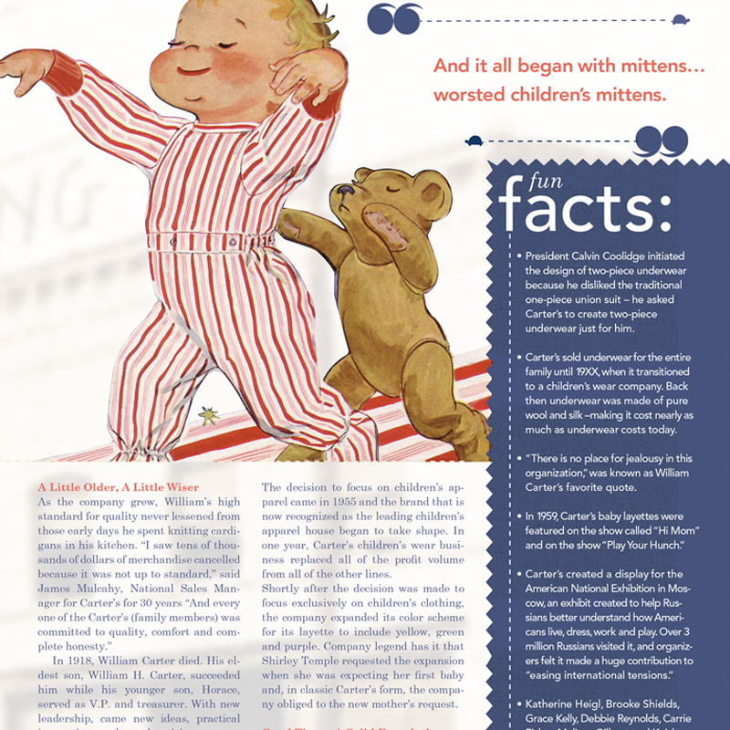
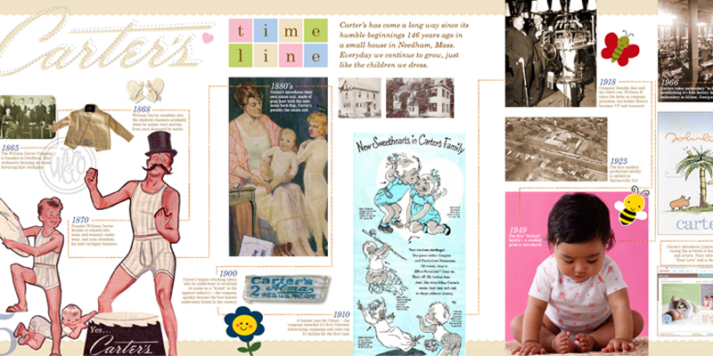
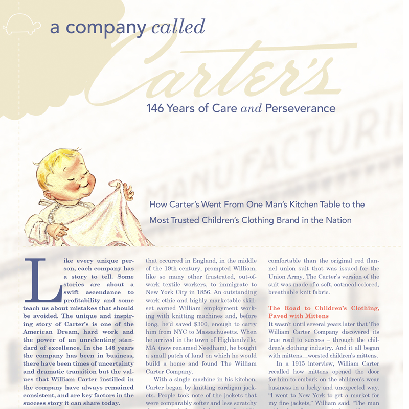
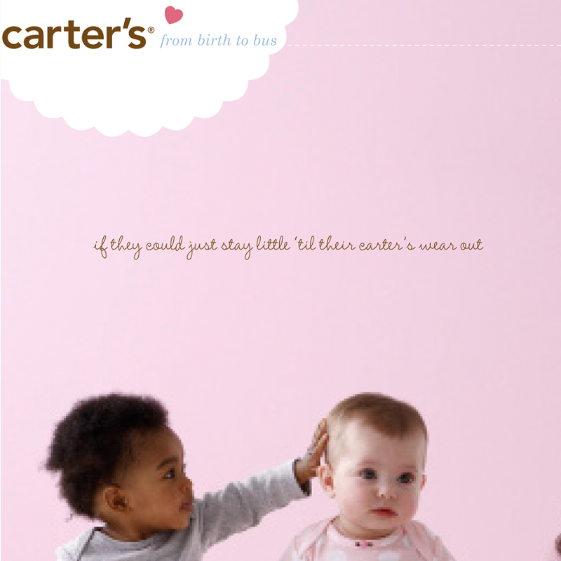
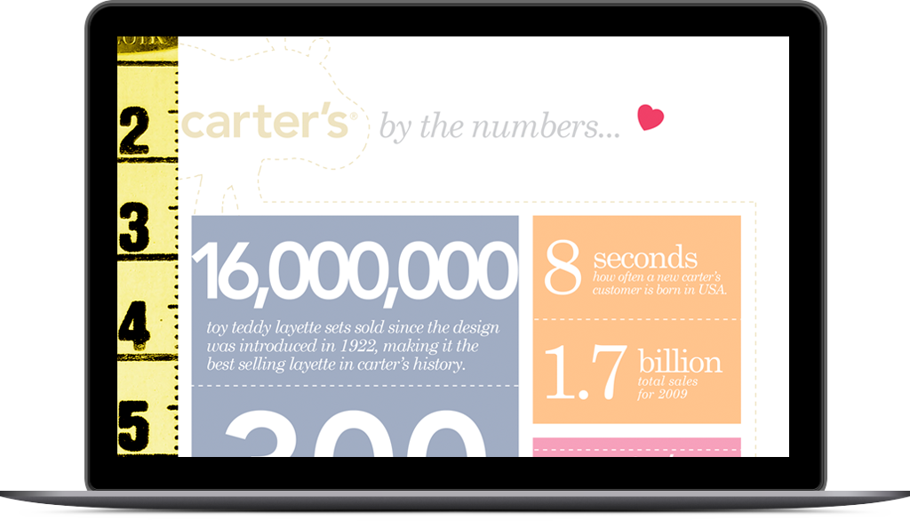
Mike Casey, the president of carter’s, which is based out of Atlanta, GA, is one of the sponsors for Bert’s Big Adventure. He asked the program’s executive director who was doing their graphics. My name came up, so he then reached out to me and asked if I would create and design a publication to commemorate the 150th anniversary of the company. Sure, why not? Here are some of my favorite layouts.
Project Dates
August, 2015
February 2016
Categories
Corporate
Retail
“The finished product tells our story. 150 years is alot to cover in 66 pages, but you found a way to make all the relevant content fit. Love the fun, innocent and playful layout.” -Mike
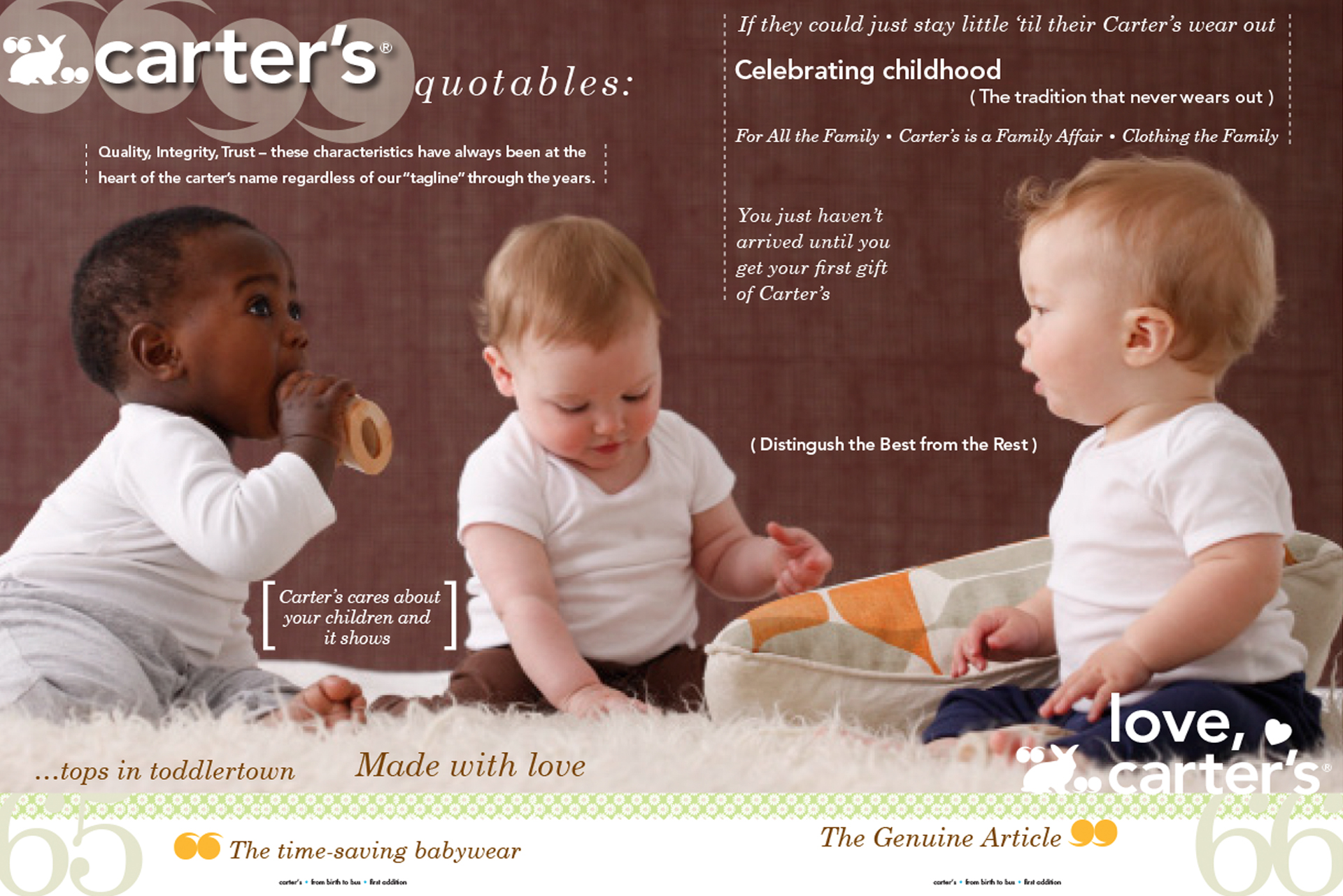
This was one of my favorite spreads in the magazine. I liked getting to break out of the traditional three column, typical editorial standard format and just play with classic type.
other projects
I would be honored to collaborate with you.
Please take the time to fill out the form so we can know ahead of time what to cover in our consulatation. Looking forward to meeting you in person!
